 DQ博客
DQ博客切换主题
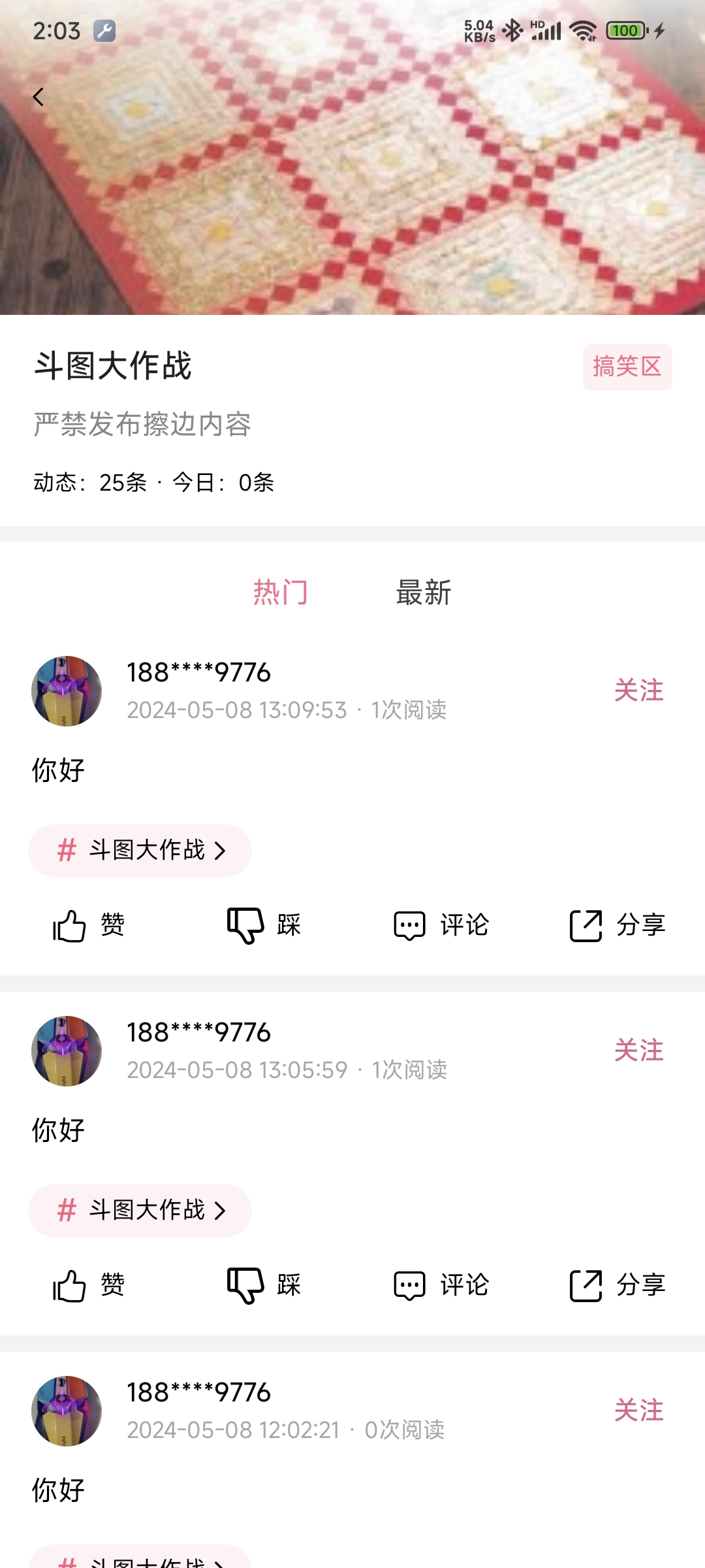
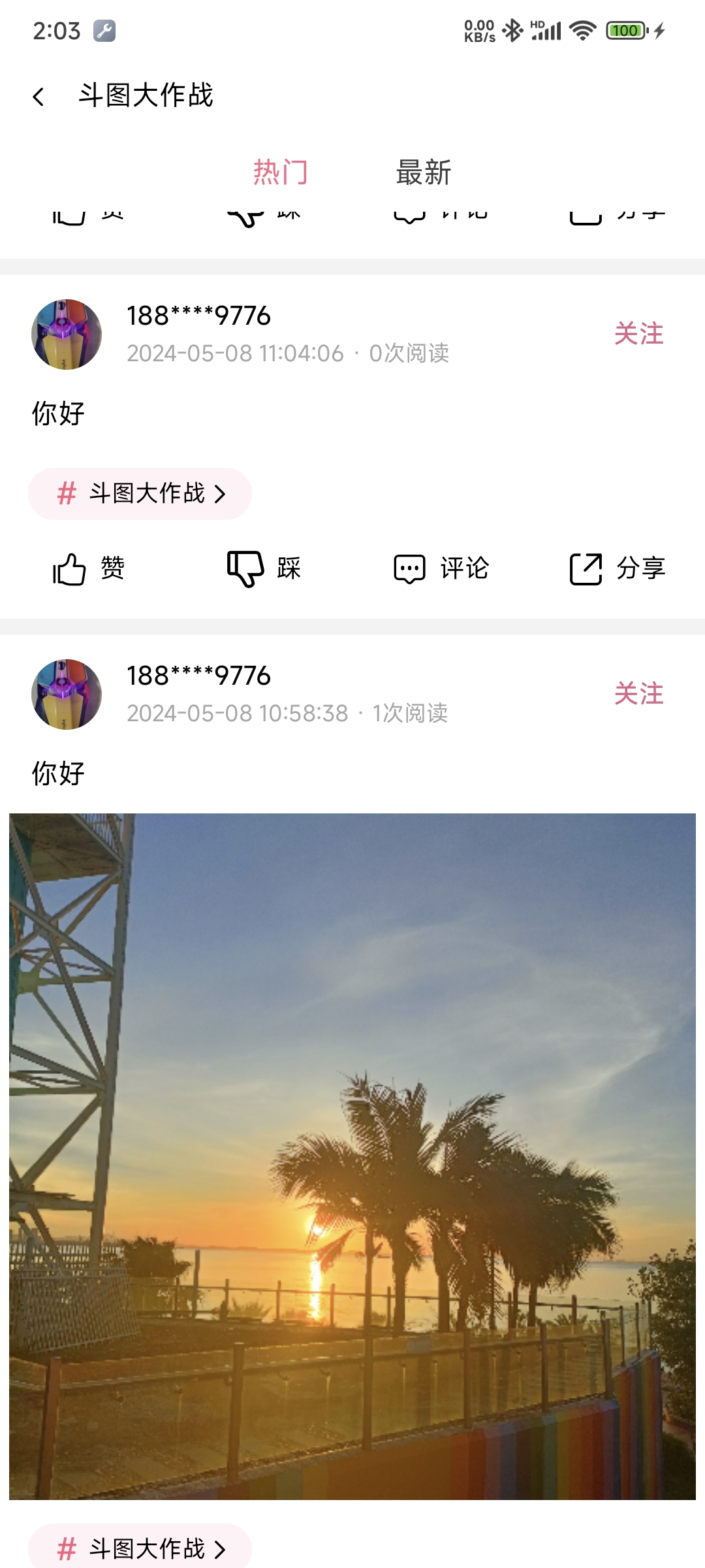
四、话题详情页
一、设计稿
二、顶部渐变颜色并显示话题标题
顶部默认样式
css
.navbar {
	background-image: linear-gradient(to bottom, rgba(255, 255, 255, 0.8), rgba(255, 255, 255, 0));
}跟随滑动改变透明度(变化规则)
ts
handleScroll(e : UniScrollEvent) {
	const scrollTop=e.detail.scrollTop
	// 渐变导航栏初始透明度
	const colorStart = 0.8
	const colorEnd = 0

	// 第一个渐变色透明度变化
	let colorStartChange=1-(1-colorStart)/this.$headerHeight*(this.$headerHeight-scrollTop)
	if(colorStartChange>1) colorStartChange=1

	// 第二个渐变色透明度变化
	let colorEndChange=1-(1-colorEnd)/this.$headerHeight*(this.$headerHeight-scrollTop)
	if(colorEndChange>1) colorEndChange=1

	// 控制导航栏渐变色变化
	this.$navbarView?.style?.setProperty("background-image",`linear-gradient(to bottom,rgba(255,255,255,${colorStartChange}),rgba(255,255,255,${colorEndChange}))`)

	// 控制标题的显示
	this.$navbarTitle?.style?.setProperty("display",colorEndChange==1?'flex':'none')
}三、文章列表多图片显示
样式
css
.one-image{
	width: 730rpx;
	height: 730rpx;
}
.two-image{
	width: 360rpx;
	height: 360rpx;
}

.more-image{
	width: 236rpx;
	height: 236rpx;
}计算属性
js
computed:{
	imageClass():string{
		const count=this.item.images.length
		if(count==1) return "one-image"
		else if(count==2) return "two-image"
		else return "more-image"
	}
}使用
vue
<!-- 单图、双图、多图 -->
<view class="content-media">
	<image v-for="(img,imgI) in item.images" :key="imgI" :src="img" :fade-show="true" mode="aspectFill" class="content_image" :class="imageClass"></image>
</view>四、点赞按钮的封装
icon-btn
vue
<template>
	<view class="icon-btn">
		<text class="iconfont icon-style">{{icon}}</text>
		<text class="count">{{count>0?count:label}}</text>
	</view>
</template>

<script>
	export default {
		name:"icon-btn",
		props:{
			icon:{
				type:String,
				default:""
			},
			label:{
				type:String,
				default:""
			},
			count:{
				type:Number,
				default:0
			}
		},
		data() {
			return {

			};
		}
	}
</script>

<style>
.icon-btn{
	flex:1;
	flex-direction: row;
	justify-content: center;
	align-items: center;
}

.icon-style{
	font-size: 22px;
	margin-right: 12rpx;
}

.count{
	color:#000000;
	font-size: 15px;
}
</style>使用
vue
<view class="actions">
	<icon-btn label="赞" :icon="'\ue6eb'" :count="item.ding_count"></icon-btn>
	<icon-btn label="踩" :icon="'\ue701'" :count="item.cai_count"></icon-btn>
	<icon-btn label="评论" :icon="'\ue648'" :count="item.comment_count"></icon-btn>
	<icon-btn label="分享" :icon="'\ue633'" :count="item.collect_count"></icon-btn>
</view>五、头像加载失败或加载缓慢的封装
vue
<template>
	<view class="avatar_box" :style="{width:width,height:height}">
		<text v-if="tip!=''" class="avatar-tip">{{tip}}</text>
		<image @load="load" @error=error class="avatar" :fade-show="true" mode="aspectFill" :src="src"></image>
	</view>
</template>

<script>
	export default {
		name: "avatar",
		props: {
			src: {
				type: String,
				default: ""
			},
			width: {
				type: String,
				default: "75rpx"
			},
			height: {
				type: String,
				default: "75rpx"
			}
		},
		data() {
			return {
				tip: "加载中..."
			};
		},
		methods: {
			load() {
				this.tip = ""
			},
			error(e : UniImageErrorEvent) {
				e.target?.setAttribute("src", "/static/default-avatar.png")
			}
		}
	}
</script>

<style scoped>
	.avatar_box {
		border-radius: 50px;
		background-color: #f2f2f2;
		justify-content: center;
		align-items: center;
	}

	.avatar {
		width: 100%;
		height: 100%;
	}

	.avatar-tip {
		font-size: 7px;
		color: #a6a6a6;
	}
</style>