 DQ博客
DQ博客切换主题
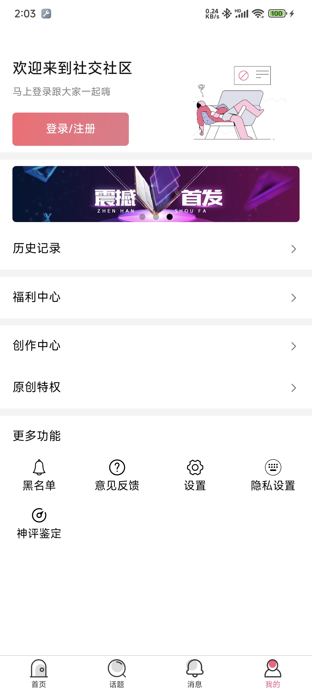
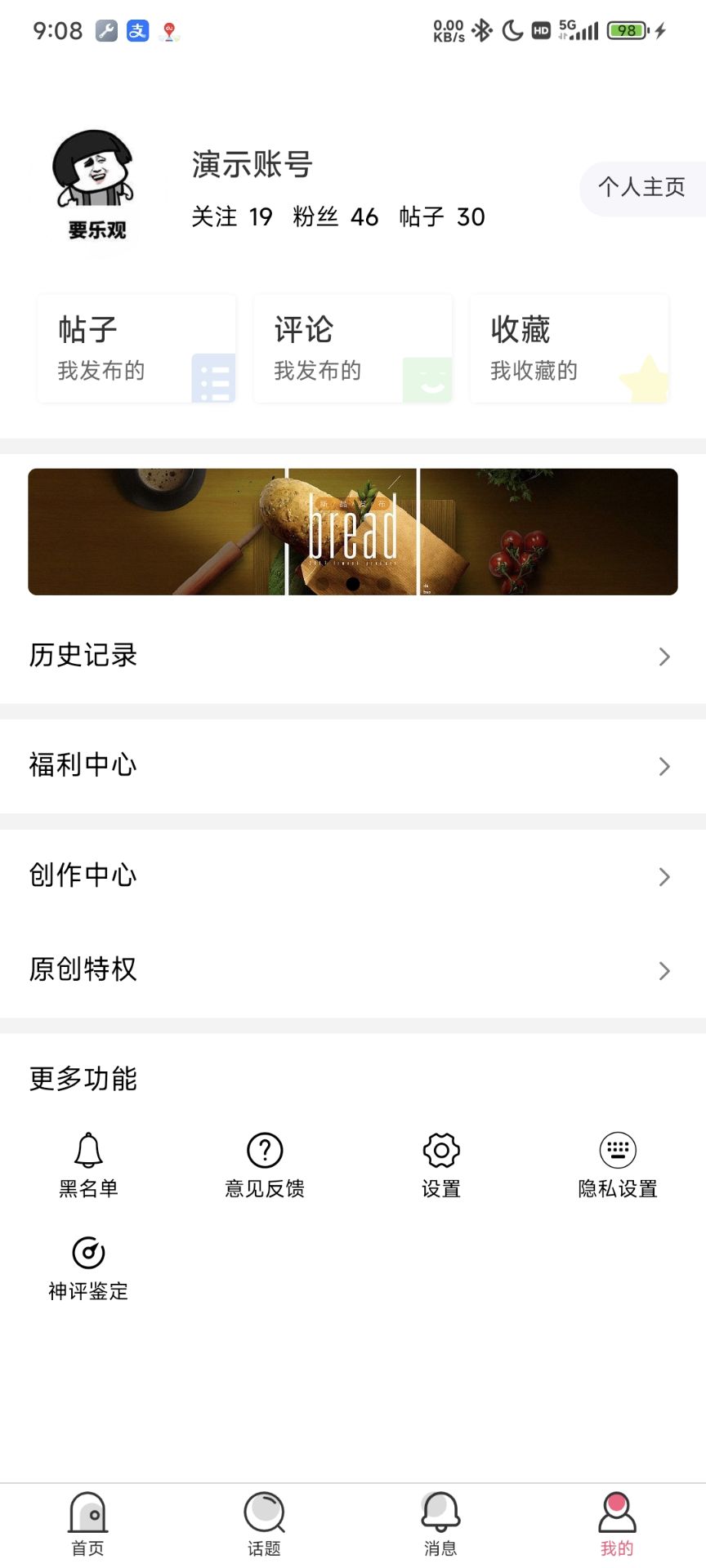
五、个人中心页
一、设计稿
二、封装按钮组件
vue
<template>
	<view class="btn" hover-class="btn-hover" :style="{width:width,height:height}">
		<text class="btn-text">
			<slot></slot>
		</text>
	</view>
</template>

<script>
	export default {
		name: "main-btn",
		props: {
			width: {
				type: String,
				required: true
			},
			height: {
				type: String,
				required: true
			}
		}
	}
</script>

<style scoped>
	.btn {
		border-radius: 5px;
		align-items: center;
		justify-content: center;
		background-image: linear-gradient(to bottom right, #fc6672, #e47989);
	}

	.btn-text {
		color: #ffffff;
		font-weight: bold;
		font-size: 15px;
	}

	.btn-hover {
		background-image: linear-gradient(to bottom right, #fd6373, #fd6373);
	}
</style>三、封装cell组件
vue
<template>
	<view class="cell">
		<text class="cell-left">{{title}}</text>
		<view class="cell-right">
			<text class="cell-tag">
				{{tag}}
			</text>
			<text class="iconfont cell-arrow" v-if="showArrow">{{'\ue60c'}}</text>
		</view>
	</view>
</template>

<script>
	export default {
		name: "cell",
		data() {
			return {

			};
		},
		props: {
			title: {
				type: String,
				default: ""
			},
			tag: {
				type: String,
				required: false,
				default: ""
			},
			showArrow: {
				type: Boolean,
				default: true
			}

		}
	}
</script>

<style>
	.cell {
		flex-direction: row;
		align-items: center;
		min-height: 100rpx;
		padding: 0 30rpx;
		background-color: #ffffff;
	}

	.cell-left {
		color: #000000;
	}

	.cell-right {
		flex: 1;
		flex-direction: row;
		justify-content: flex-end;
		align-items: center;
	}

	.cell-arrow {
		color: #808080;
	}
</style>四、加强话题详情封装的icon-btn组件
vue
<template>
	<view class="icon-btn" :class="{columnBox:column}" :style="styles">
		<text class="iconfont icon-style">{{icon}}</text>
		<text class="count">{{count>0?count:label}}</text>
	</view>
</template>

<script>
	export default {
		name: "icon-btn",
		props: {
			icon: {
				type: String,
				default: ""
			},
			label: {
				type: String,
				default: ""
			},
			count: {
				type: Number,
				default: 0
			},
			column: {
				type: Boolean,
				default: false
			},
			width: {
				type: String,
				default: ""
			}
		},
		data() {
			return {

			};
		},
		computed: {
			styles() : string {
				if (this.width != '') return `width:${this.width};`;
				else return 'flex:1;'
			}
		}
	}
</script>

<style>
	.icon-btn {
		flex-direction: row;
		justify-content: center;
		align-items: center;
	}

	.columnBox {
		flex-direction: column;
	}

	.columnBox .icon-style {
		margin-right: 0;
		margin-bottom: 5rpx;
	}

	.icon-style {
		font-size: 22px;
		margin-right: 12rpx;
	}

	.count {
		color: #000000;
		font-size: 15px;
	}
</style>